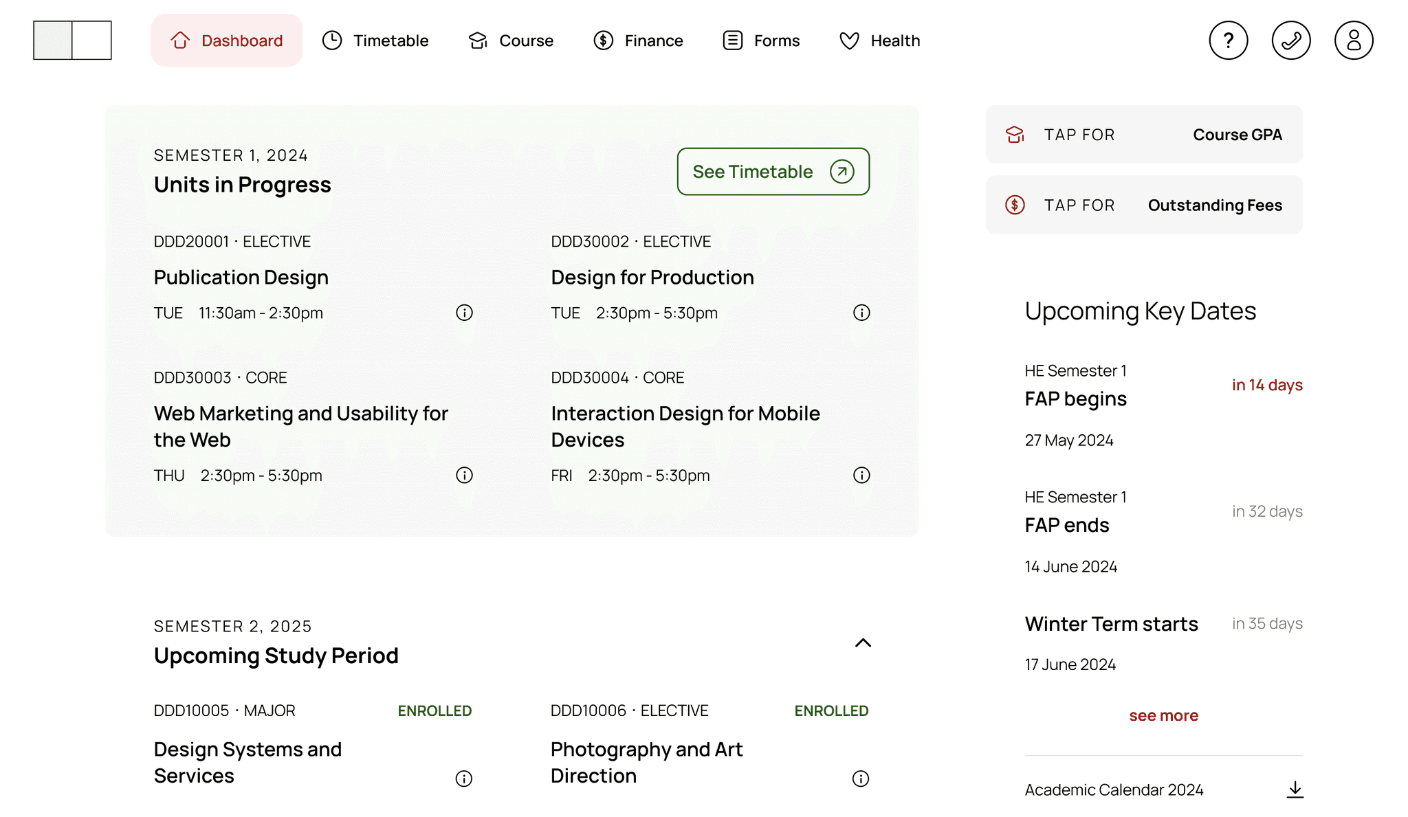
This project was not professionally affiliated with Swinburne University.
OVERVIEW
The “SwinPortal” project focuses on redesigning Swinburne’s student portal to significantly enhance user experience and reduce the support burden on staff.
The project identified problems through in-depth user research and analysis, which were further explored via competition benchmarking and a UX analysis.
Insights from primary and secondary research, along with heuristic evaluations, informed the final recommendations.
THE GOAL
The primary goal of the “SwinPortal” project is to enhance the overall user experience by creating a more intuitive and user-friendly interface that simplifies navigation and accessibility. It seeks to create a seamless digital environment that supports academic success and operational efficiency.
THE TEAM
Individual project by Zy Thoong L.
THE PROBLEM
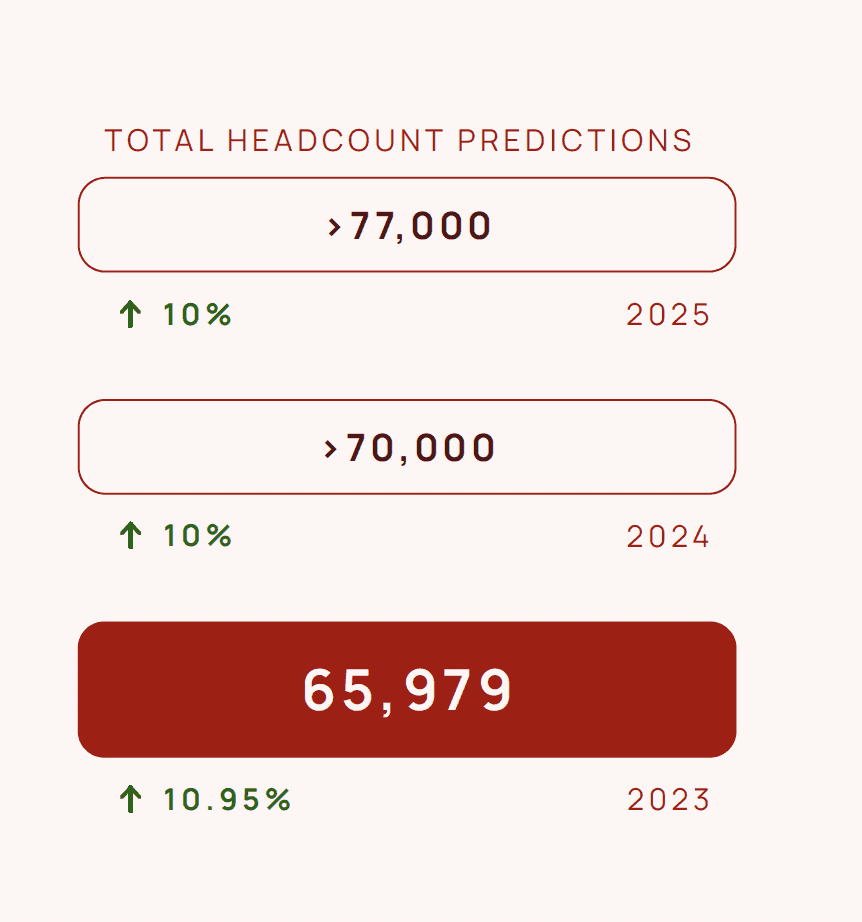
Swinburne University’s 2023 Annual Report shows that almost 66,000 students regularly accessed their student portal during the semesters.
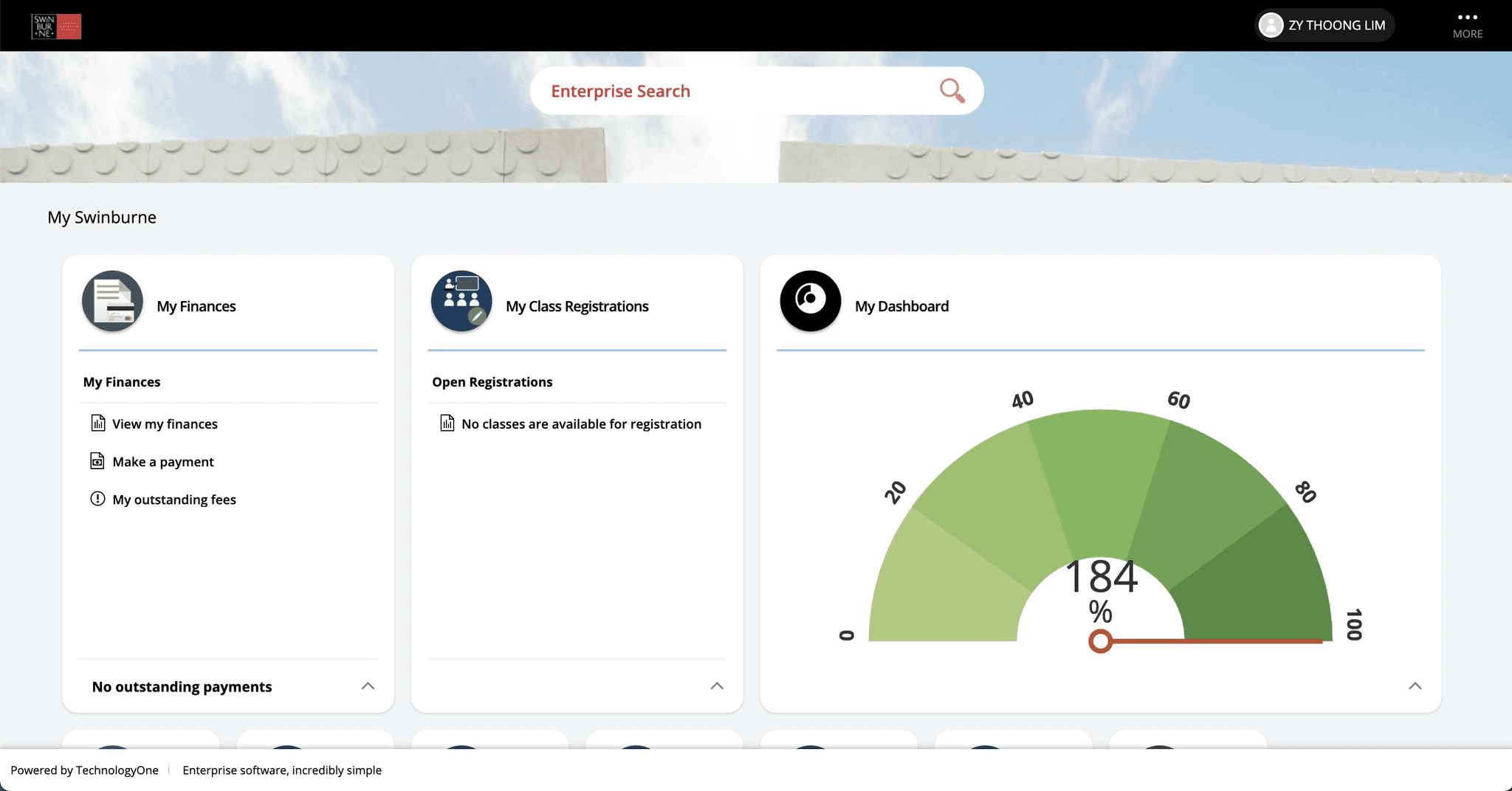
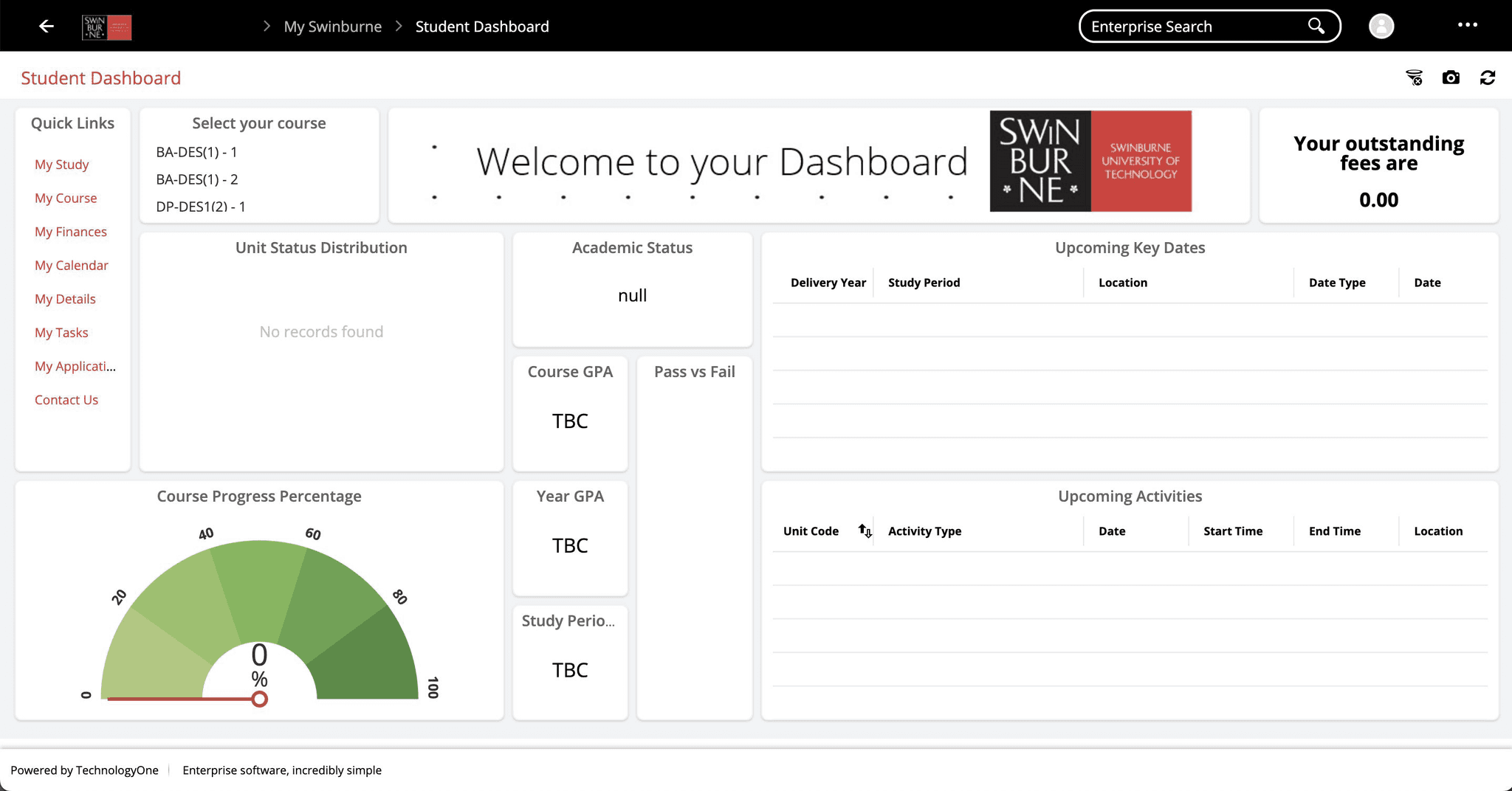
The Existing Student Portal
A campus-wide experience survey received 52 responses, of which 7 students volunteered to share more of their experience through interviews and participating in usability testing.
The average ratings from 52 students are approximately 56-57% on a platform where all students must access and perform essential tasks.
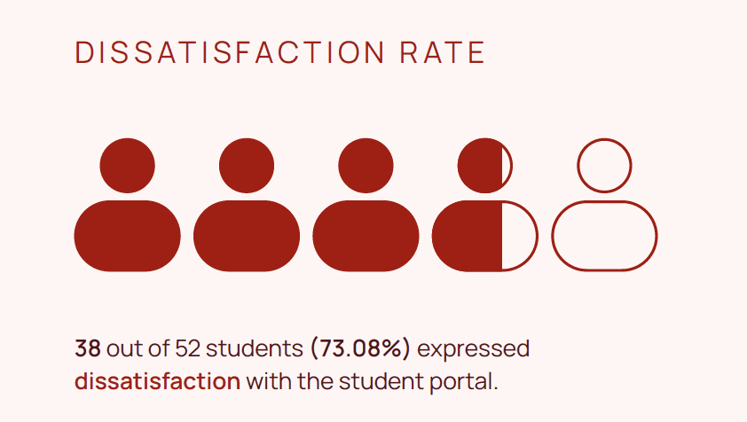
Based on student comments, 73.08% were dissatisfied with the existing student portal, making it almost 4 out of 5 students struggle with using the crucial platform.
What could be the problem?
Two questions stood out from the research:
USER PROBLEM #1
“I’m overwhelmed, what is happening?”
USER PROBLEM #2
“How do I do that again?”
COLLATERAL PROBLEM
Substantial strain on staff support
Students struggling with the student portal tend to turn to the university student services for support, creating a heavy staff support burden and prohibiting attention to be given to serious student administrative issues.
User Experience (UX) Analysis
To dive deeper into the issue, a few steps were taken to understand the core problem:
Visualise the site map of the existing student portal
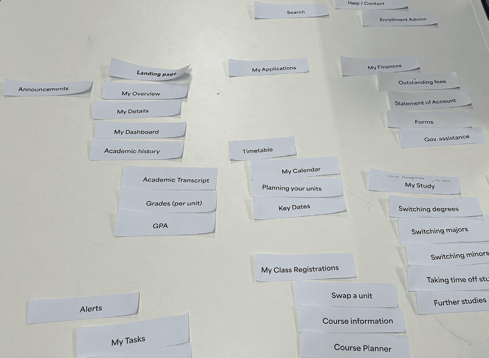
Host and facilitate a focus group to receive insights into the mental model of students on the information architecture (IA) (pictured)
Conduct a heuristic evaluation and list key usability issues
The most severe usability issues identified that negatively impact the student experience were:
Difficulty understanding what is happening in the system
Difficulty remembering how to perform essential tasks
Difficulty recognising buttons and interactive elements
To narrow the scope of the project, focus was directed towards one primary issue and two key heuristics.
ROOT OF THE PROBLEM
Intuitiveness of the design
HEURISTIC HIGHLIGHT #1
Visibility of system status
HEURISTIC HIGHLIGHT #2
Recognition over recall
PROPOSING A REDESIGN
The Design Process
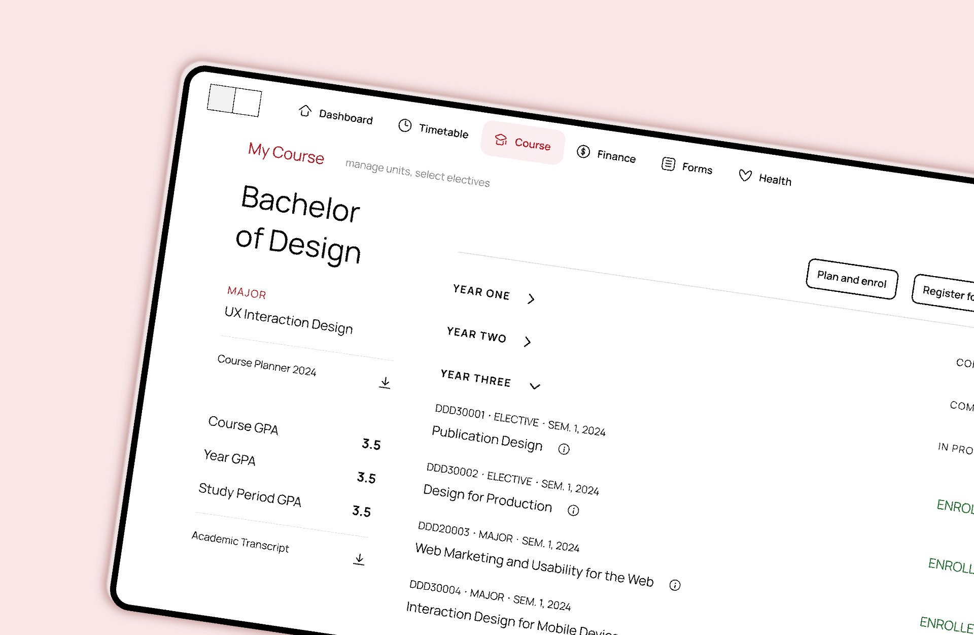
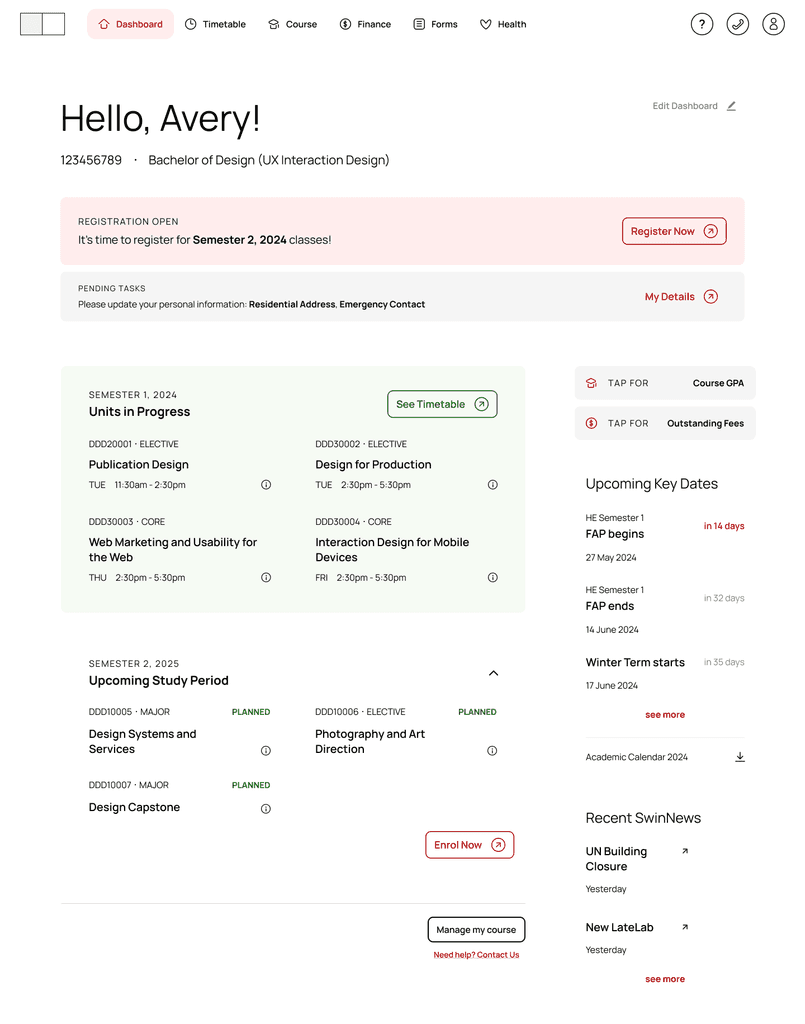
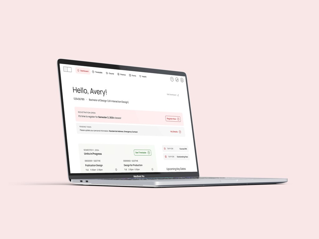
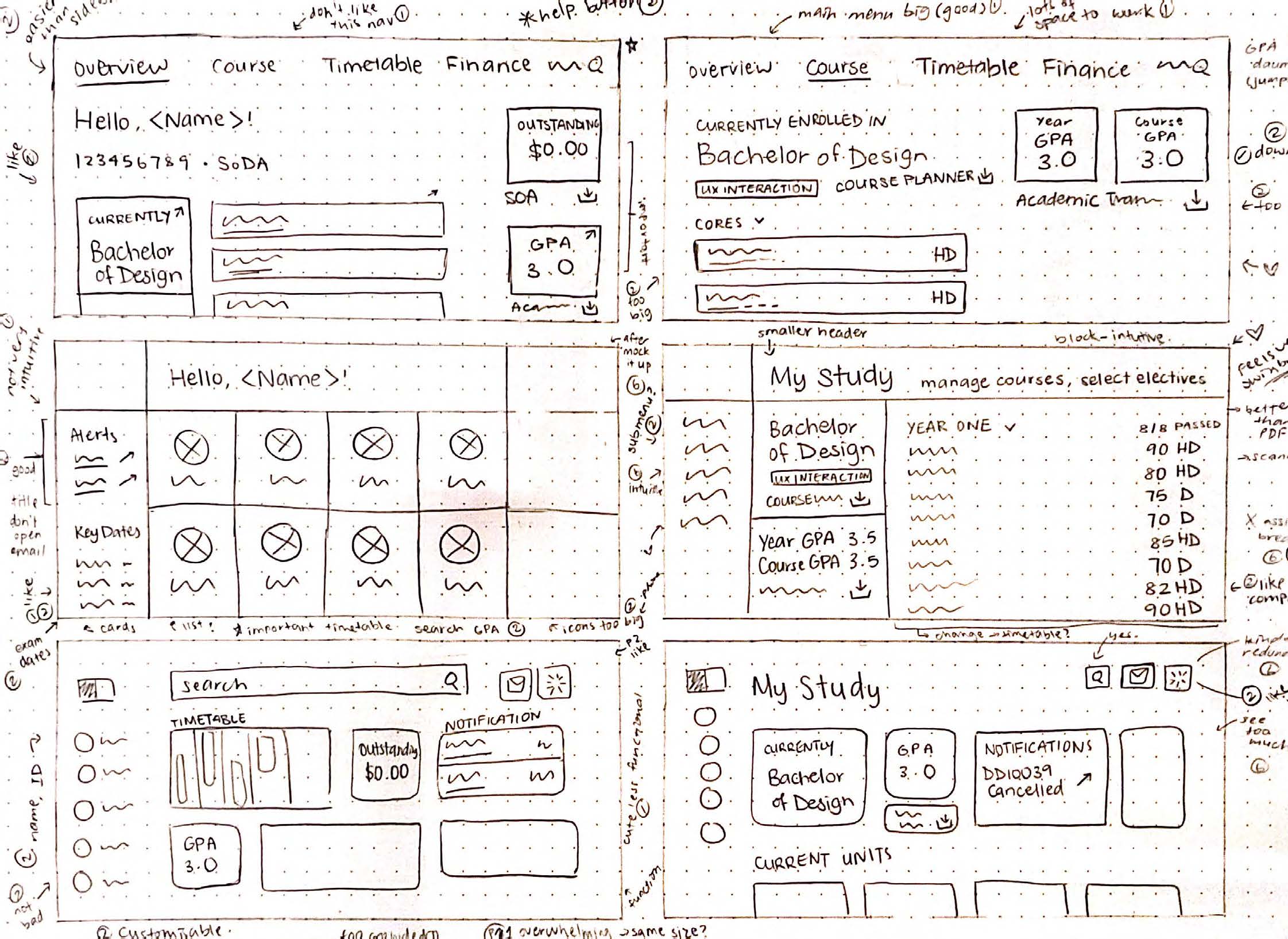
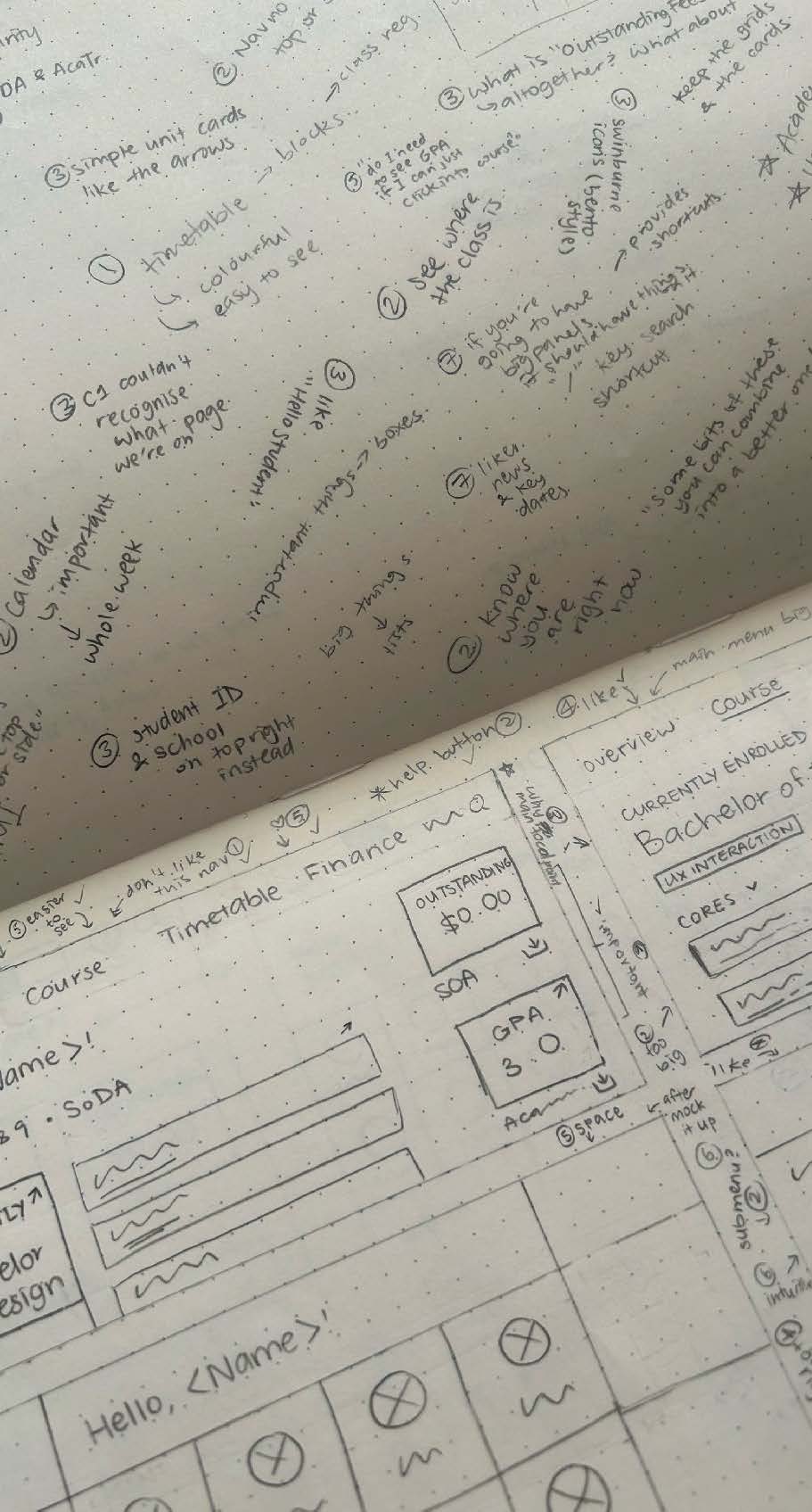
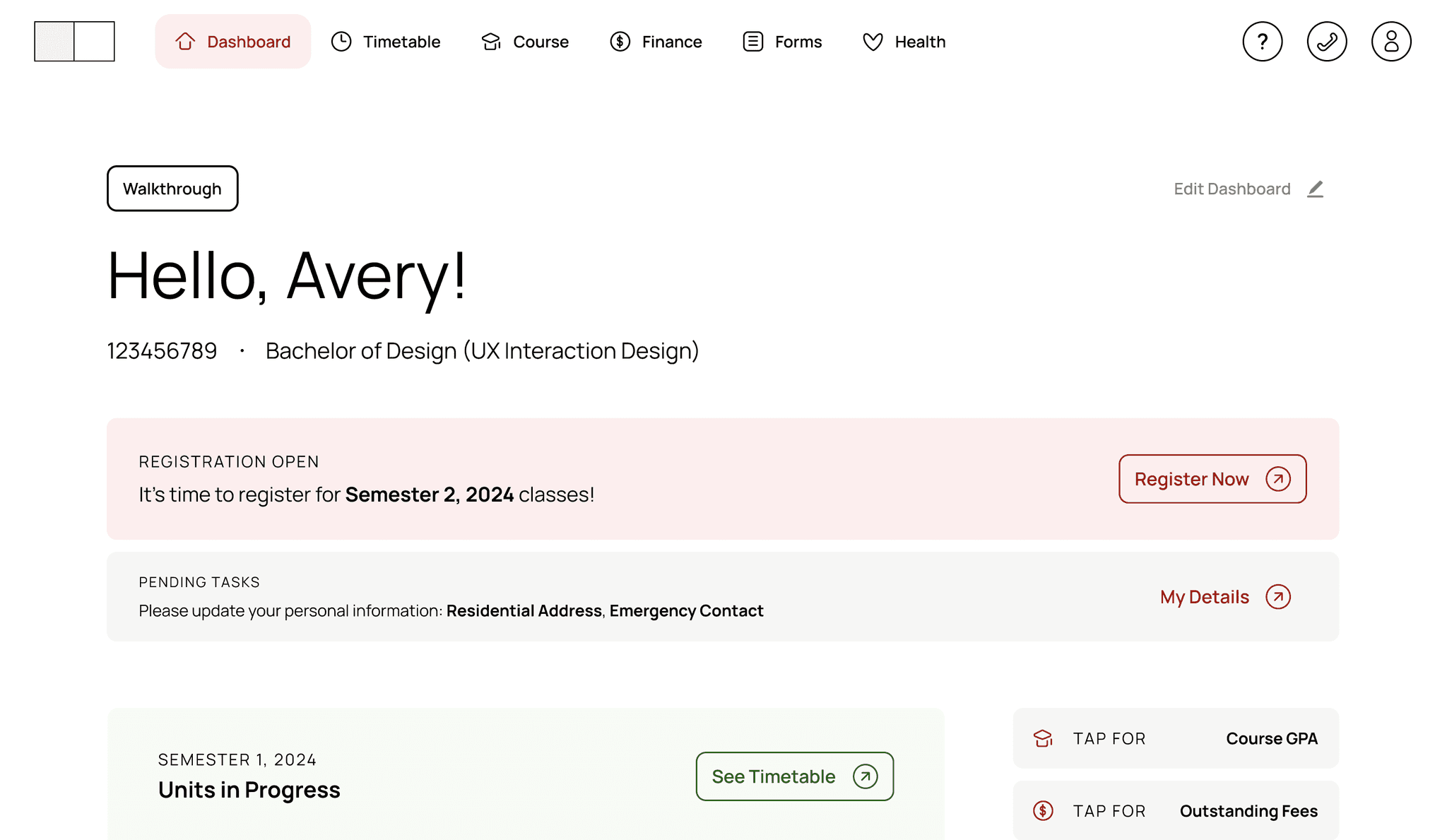
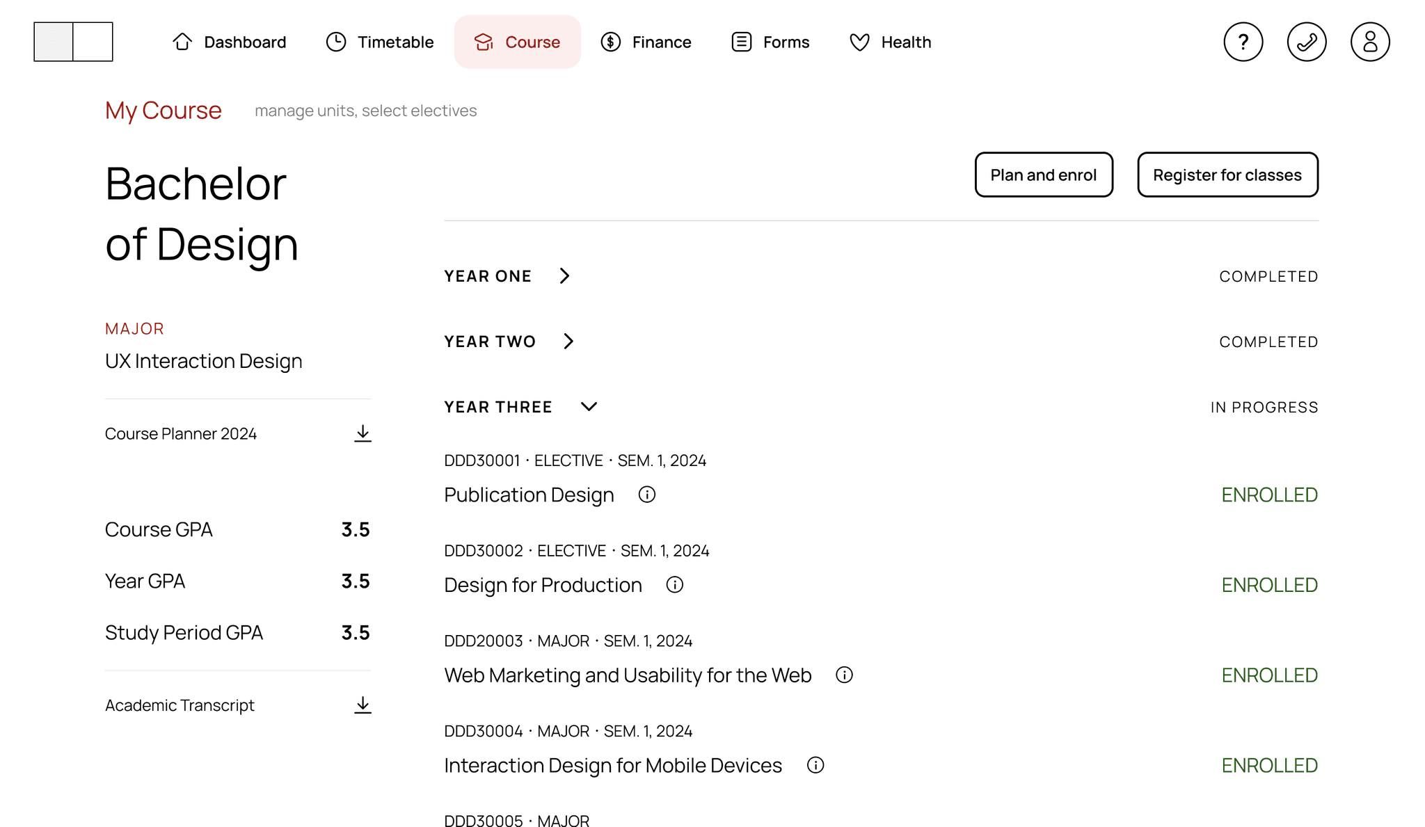
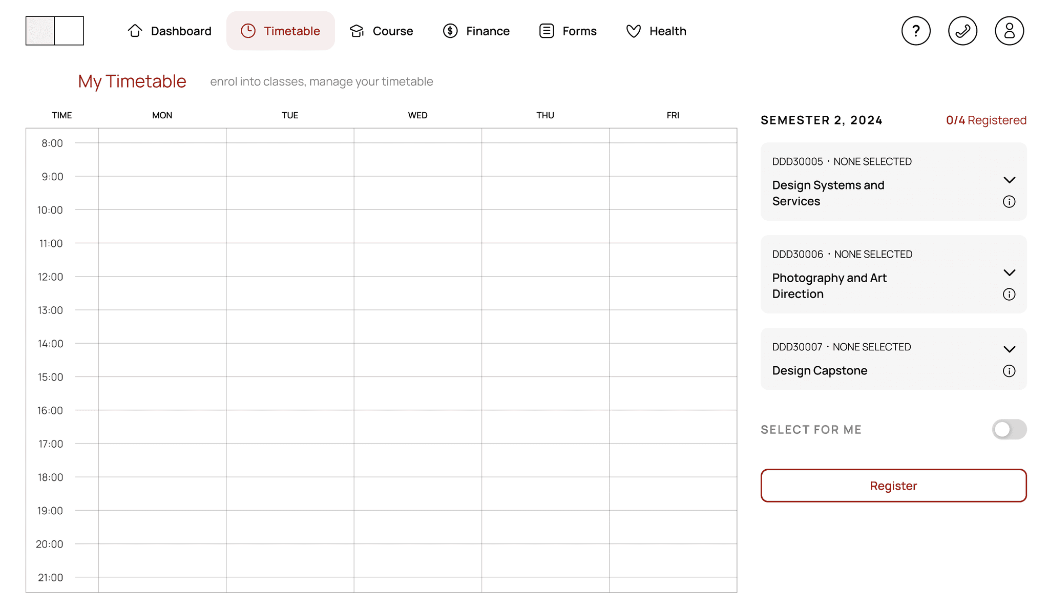
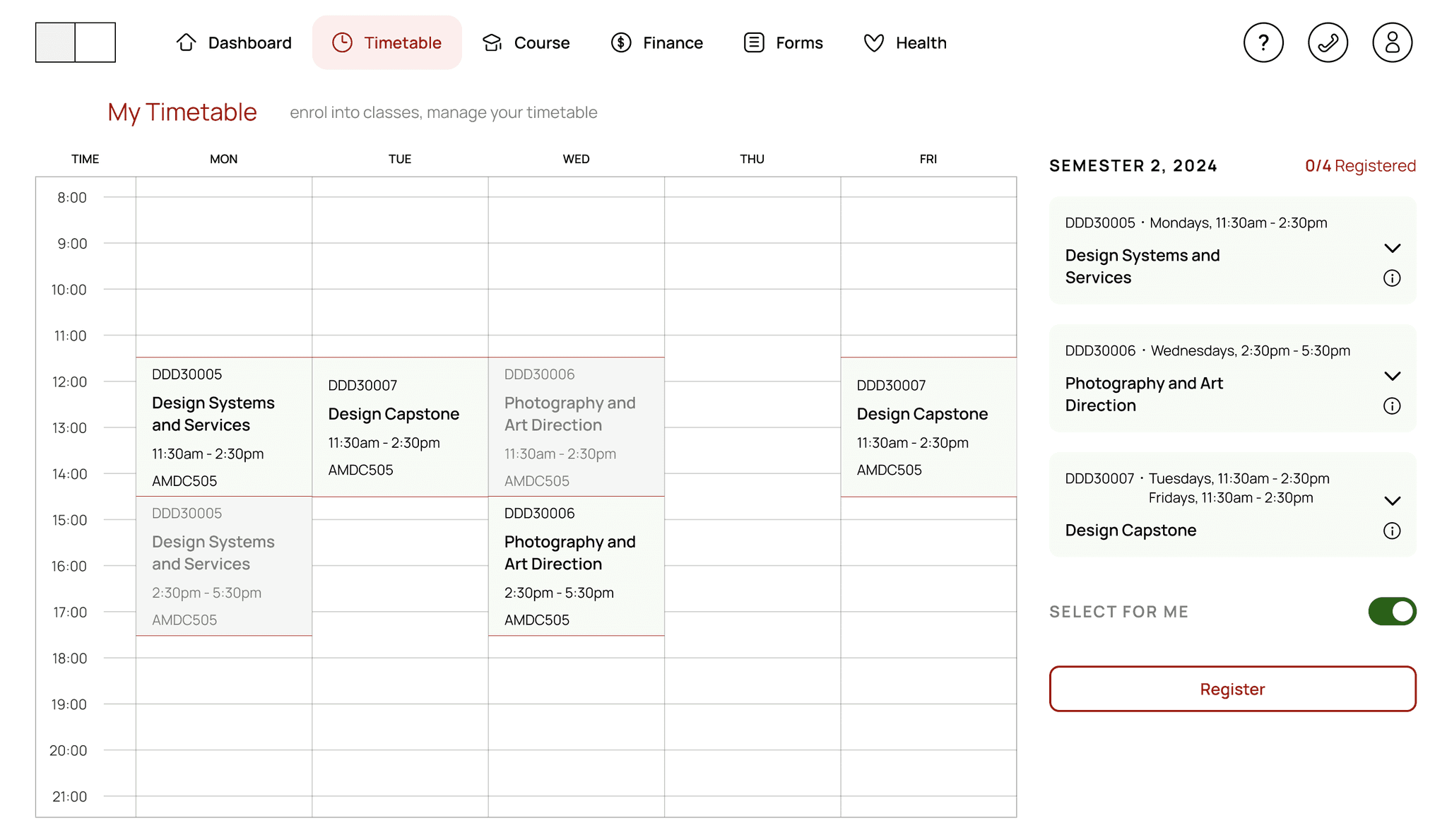
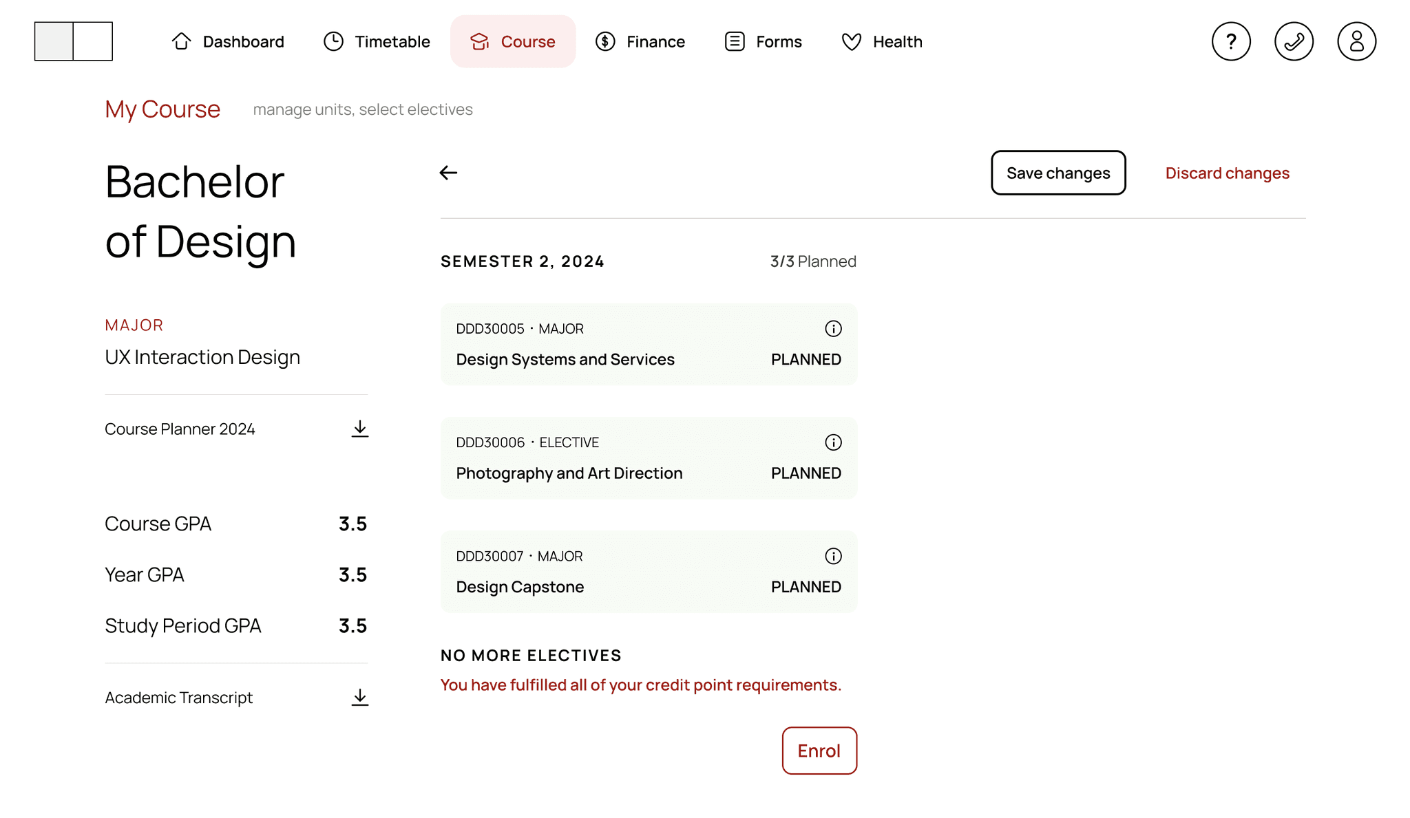
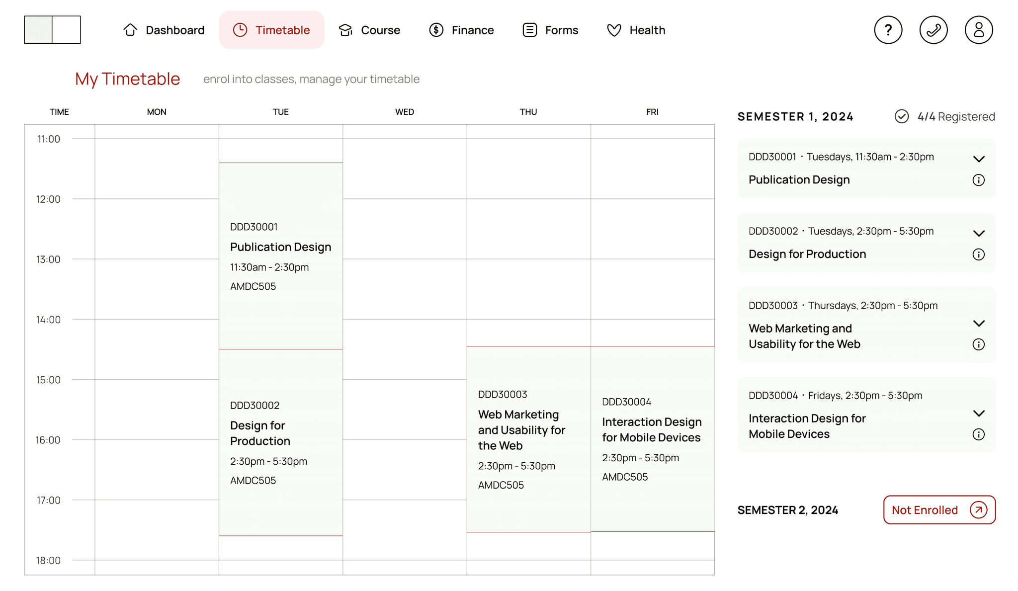
Through two user feedback sessions and one usability testing with Swinburne students, we co-designed a reimagined student portal as a proposal for a redesign of the current student portal.
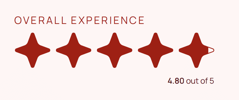
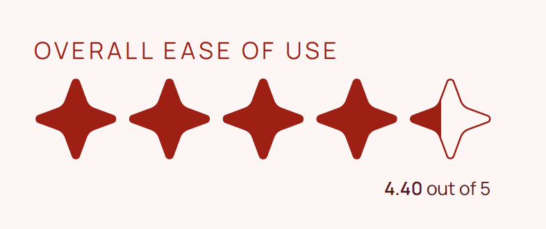
At the end of the usability testing, the survey results revealed that the proposed redesign received approximately 73.21% higher ratings in overall user experience and approximately 54.39% higher ratings in ease of use.
The proposal for the redesign prioritises:
Revising the information architecture (IA) to streamline navigation
Improving error messages and feedback to reduce confusion
Enhancing accessibility considerations to make the portal more accessible
Suggesting more intuitive processes for enrollment and registration
POTENTIAL IMPACT
With an enhanced student experience on the student portal informed by a redesign, students are more likely to feel less overwhelmed when performing important tasks such as enrolling and registering for classes.
At the rate Swinburne University’s headcount is growing every year, the redesigned student experience on the student portal could impact more than 70,000 students per year, in the near future.
CONCLUSION
As the Swinburne student portal is a crucial platform in every Swinburne student’s pursuit of education in the wonderful institution, the user experience (UX) must be thoroughly considered.
SwinPortal gave me an opportunity to work closely with my target audience to understand user pain points and thoroughly conduct user research to come up with solutions for a real-world problem.
FUTURE PLANS
Further iterations of user interfaces (UI)
More usability testings to gather feedback from target users (Swinburne students)
Considering the experiences with other key functions of the student portal
